I often hear clients exclaim that even though they communicated their message, it still wasn’t heard. It’s a frustrating situation: the organization takes tremendous time and effort to get the message out, and then cue the crickets…
As a communicator, my job is to ensure that the message is received and understood by the intended audience. Are we using the right channel? Do we have the right timing? Is the message and call to action clear? The variables are almost infinite. Often, though, the problem is that the message is too cluttered, cumbersome, and not specifically dialed to the people that it is intended for.
Before you start on the road to communication zen, think about what you want to achieve.
Three steps to zen:
- Write for your audience
- Write in plain language
- Use a design that helps makes sense of the information.

I was thinking about a plain language guidebook I was drafting for a client during my elevator ride home the other day. I live on the fourth floor – the top one – and park in the parkade, so my elevator ride is the longest, covering five levels.
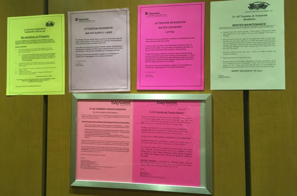
The building manager uses the two letter-size frames inside the elevator to display notices, much like municipalities do at doorways and reception areas of city halls and recreation centres. Here’s the problem: I simply don’t have time to read even a portion of just one of the six (SIX!) lengthy notices posted on the car’s wall.
The only thing these notices achieve is for the building manager to say residents were informed. We told you, didn’t you read the notice? If anyone breaks a rule outlined in one of these notices they can’t claim ignorance of the law – because there’s the law, printed and posted for everyone to read.

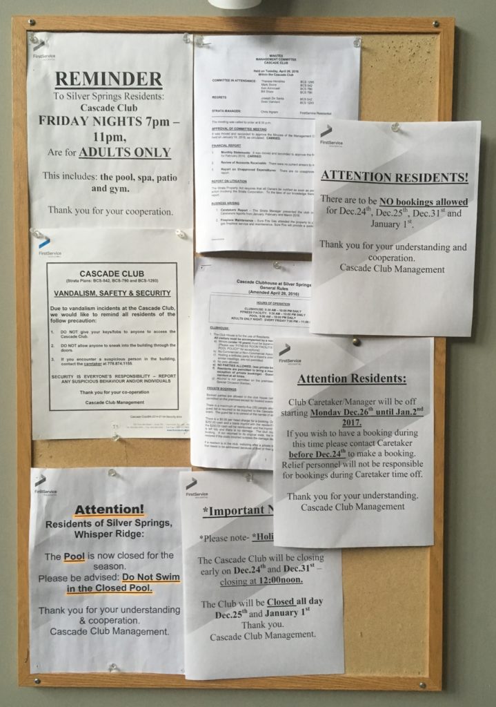
The situation over at my strata’s recreation centre is the same. There are eight (EIGHT!) notices posted to the windows around the front door, and another eight (EIGHT!!) on the cork board outside the weight room. I’m not sure about you, but I’m not keen to stand outside a building (in the dark, in the rain, and blocking the way of others trying to get in or out) and dutifully read all the notices taped up on my way to the pool or weight room.
How does this happen?
It’s an easy out to post a sign at a doorway. One person does something wrong (smokes where they’re not supposed to, disposes of garbage incorrectly, is confused about the operating hours) and someone in charge demands a sign. Someone else crafts it in Word, or if they’re feeling creative, in PowerPoint, or PrintShop, makes the font as big as possible, cuts-and-pastes the necessary verbiage outlining the rules, adds some clipart and – wait – we need the logo on there! and poof, you’ve got yourself a door sign. Make the font bigger and bolder, and maybe underline it, too. Print it on coloured paper so it stands out. Done!
Is there a better way?
Absolutely there is a better way. If you find your entry ways have become a repository of rules, regulations, important notices and Wait! Read this! messaging, you can still ensure visitors and facility users know what they need to know. Try these steps:
- Take an inventory of the signs and notices displayed at doorways and reception areas.
- Identify what you really need to display, and what isn’t necessary or relative for that location.
- Redo wording to keep it short, simple and to-the-point (signs should not be lengthy sentences or paragraphs)
- Use icons or graphics instead of words
- Keep fonts simple and consistent
- Resist the urge to make everything bigger (though big enough that it can be read with a passing glance)
- Test it out – ask a few staff members or regular patrons if they say and read the notices
- Be ruthless about adding more notices
- Develop a simple style guide and process for sign and notice requests
Not sure how you can achieve messaging zen at your facility? Use these steps and take a critical look at what your front entryways say to visitors. Still not sure? Get in touch to discuss quick fixes and your style guidelines.

